斑斓的语言学校及科学中心,澳大利亚,McBride Charles Ryan
|
澳大利亚墨尔本的 McBride Charles Ryan 建筑事务所已被宣布成为2016年度 WAN Colour in Architecture Award 色彩建筑奖项的获奖者,他们设计的高年级语言学校和科学中心是一个充满活力和吸引力的项目,颜色的使用是他们这次设计的核心理念。 McBride Charles Ryan of Melbourne, , Australia, has been announced as the winner of the WAN Colour in Architecture Award 2016 for their Ivanhoe Grammar Senior Years & Science Centre, a project that places a vibrant and engaging use of colour at the heart of the design concept. ▼ 充满活力的教育建筑,a vibrant institutional architecture
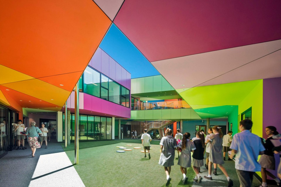
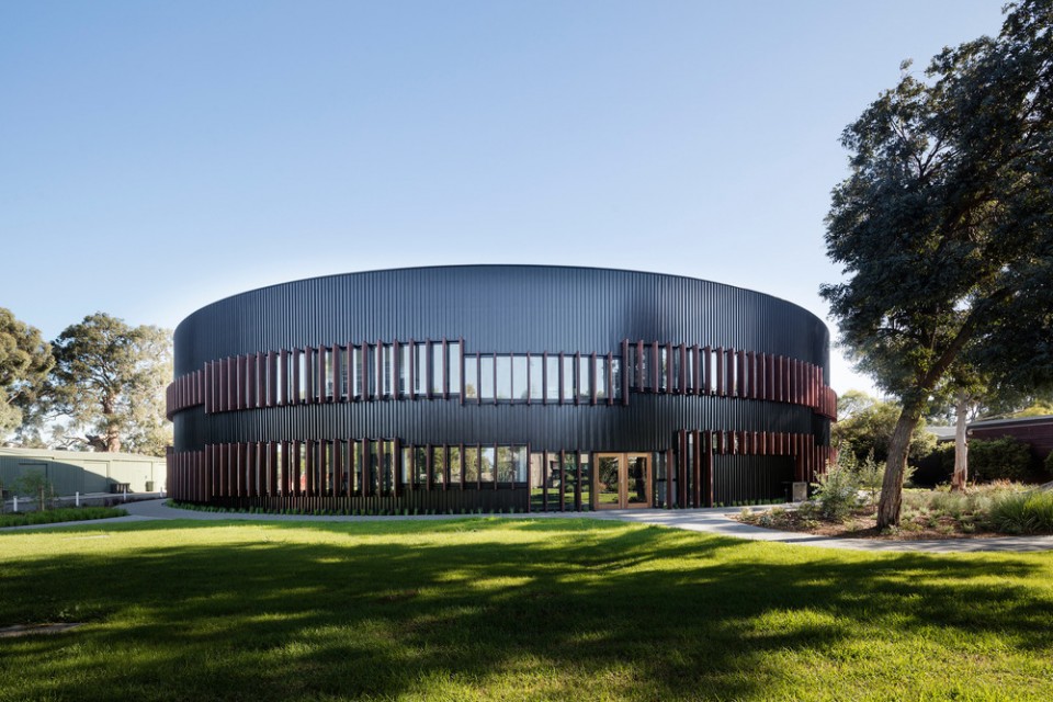
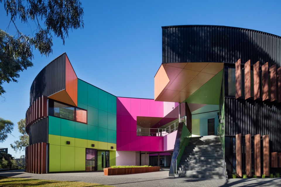
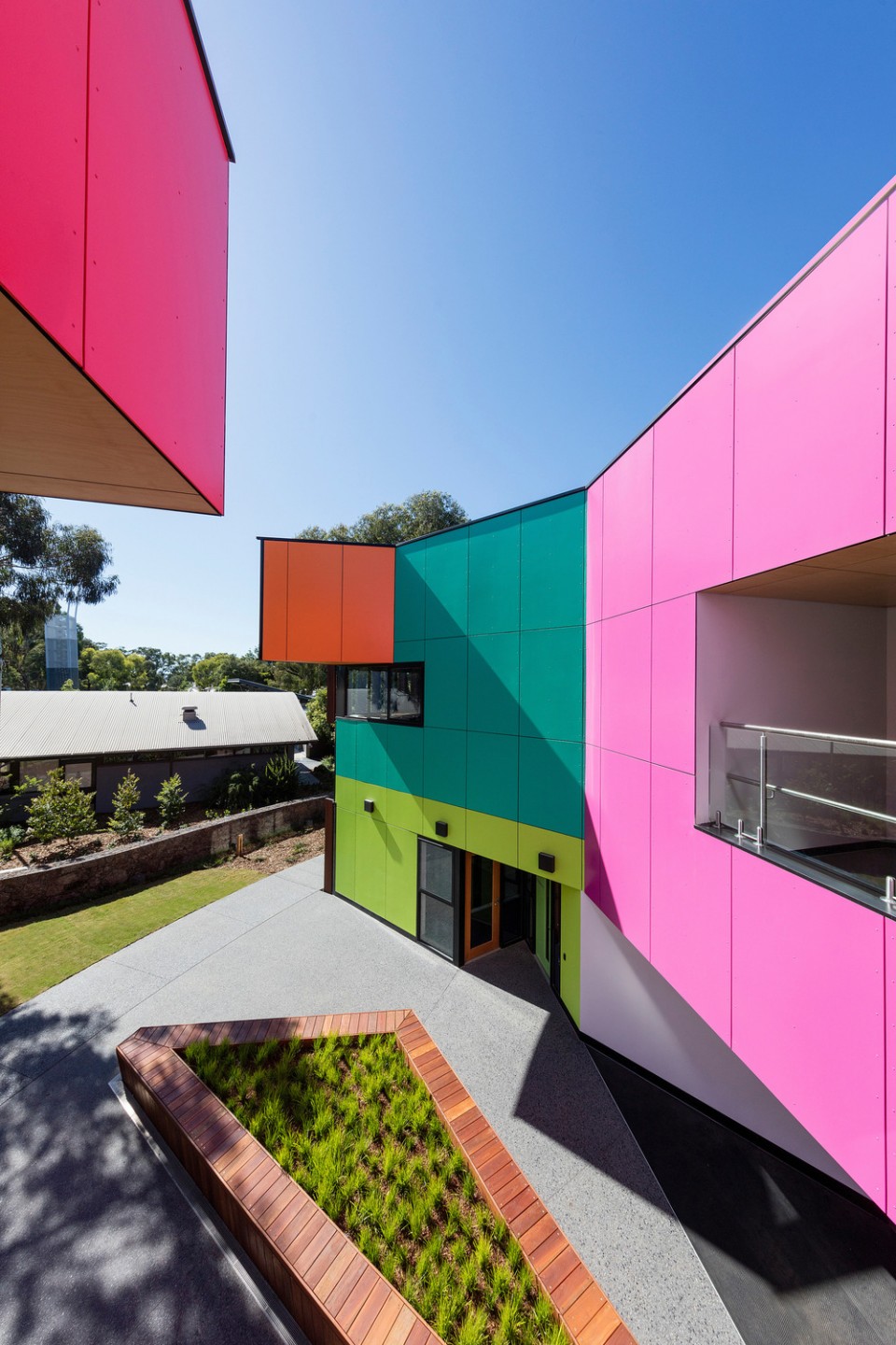
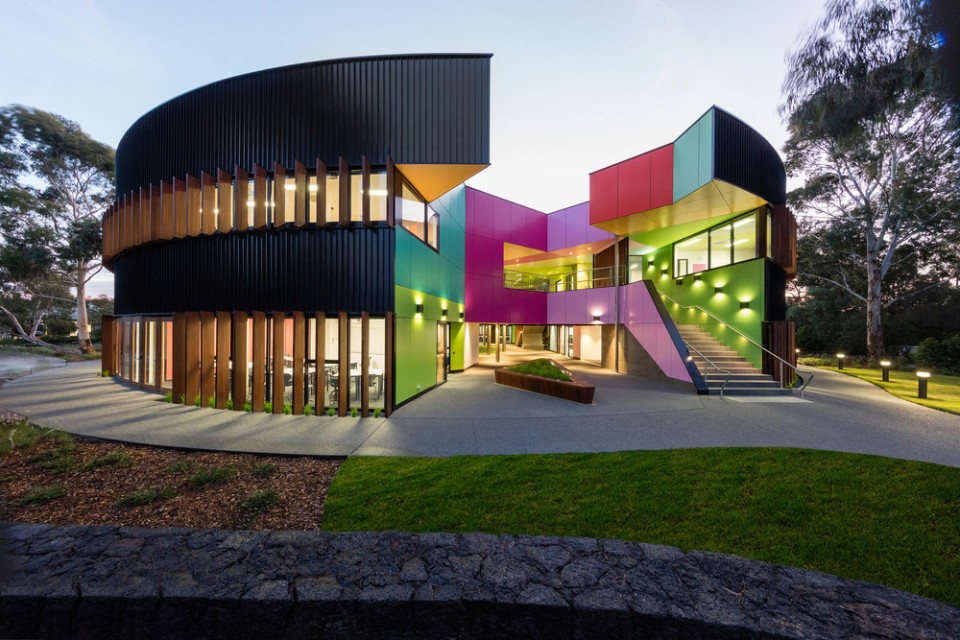
这所新校舍包括各种一般的学习区域,为高年级教师和科学中心提供服务。圆形的平面是根据学校原始的总·体规划加入了适当的地区文化后形成的。然而,建筑内部并没有单调的重复外边流线形的形态,设计团队选择使用几何的切割手法和颜色来定义中庭的空间,包括光井和学习区域。 The brief for this new school building included a variety of general learning areas, provision for the senior year teachers and a science centre. The circular shaped plan had an appropriate civic quality based on the school’s original masterplan. However, rather repeating the circular pattern inside, the designers chose to use geometry and colour to define the central courtyards, light wells and learning spaces. ▼ 圆形的建筑外观,the circular shaped appearance
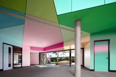
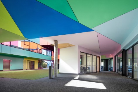
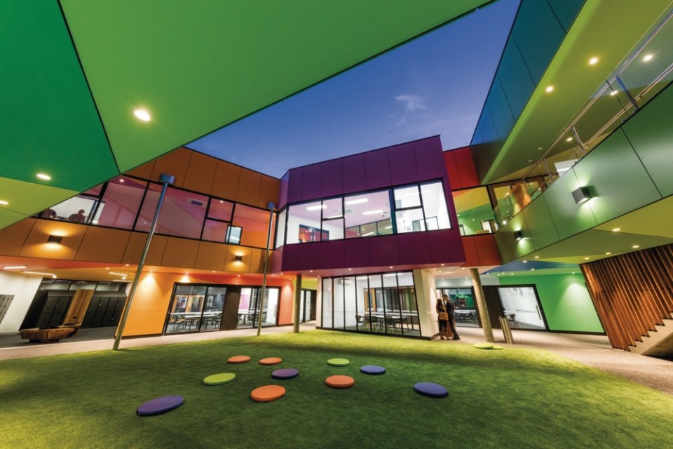
▼ 中庭中定义空间的颜色和几何图案式的分割方式,the central courtyards are defined by geometry and colour
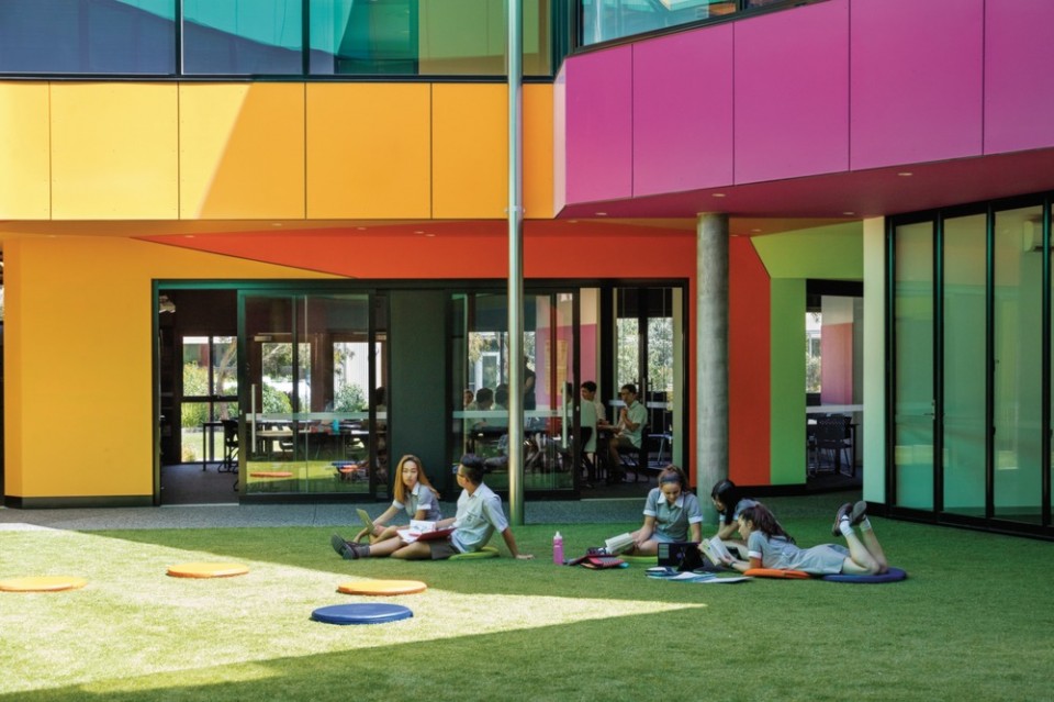
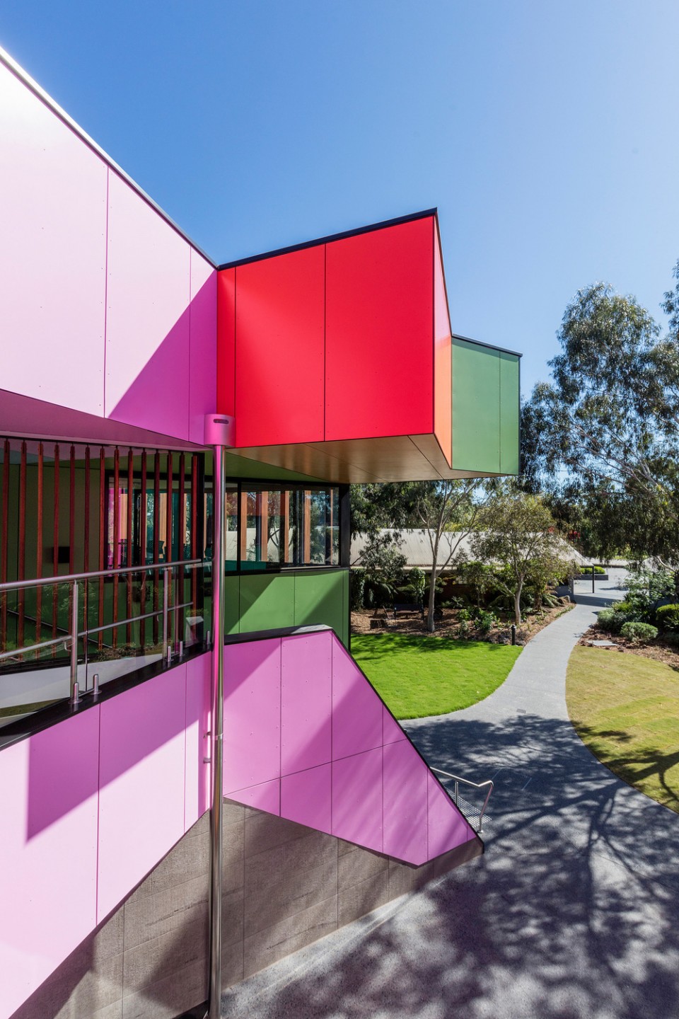
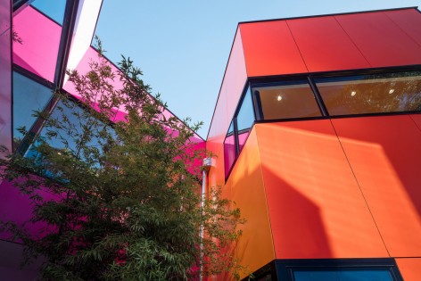
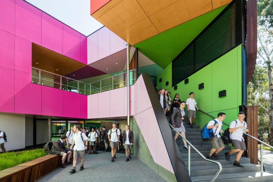
内部的尖锐的转角和鲜艳的色彩与外部圆形的结构和柔和的色调形成鲜明的对比。在主入口的为之,建筑的圆形外壳被“侵蚀”,通过这种充满活力的设计来表达科学和学习能够带来的奇迹。奖项的评委们很喜欢这些缺口中透出的彩色内部空间所带来的惊喜。设计师的灵感来自于蛋壳内部隐藏的内核,以及万花筒中展示出颜色和图案的无限组合。 The sharp angles and vivid colours of the interior form a dramatic contrast with the round form and muted tones of the drum-like outer structure. At key entry points, the drum is ‘eroded’ to reveal the wonders of science and learning expressed through this vibrant design. The jury of this award was delighted by the surprise of the coloured inner spaces as revealed through these openings. The designers were inspired by the idea of an eggshell hiding an inner core, and by kaleidoscopes, where a view inside reveals seemingly infinite combinations of colour and pattern. ▼ 入口处大面积实用的颜色带给使用者惊喜,the colour was applied to the main entrance bringing a surprise to the users
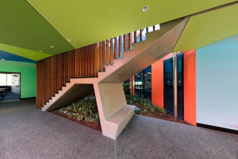
▼ 建筑内部的细节,detail ofthe building
“我认为在设计中最令我着迷的东西是,这个项目从一开始就是关于颜色的。” Per Nimer,设计总监 “I think that what fascinates me – and what makes it a winner – is that this project is obviously about colour from the start.” Per Nimer,Design Manager at Akzonobel and Zlatko Slijepcevic “它看起来像一个平凡的鸡蛋,但当你打开它时,它中间有宝石的颜色。 Karen Haller,应用颜色心理学顾问 “It does look like an egg and when you break it open, there’s this jewel of colours in the middle.” Karen Haller,Applied Colour Psychology Consultant at Karen Haller Colour & Design “我认为这个建筑在澳大利亚有阳光明媚的环境下,对于孩子来说,一定是辉煌的。” Morag Morrison,建筑事务所合伙人 “I think that it works in the context of Australia, where there’s bright sunshine. For kids, it must be brilliant.” Morag Morrison,Partner at Hawkins\Brown ▼ 中庭周围的彩色空间,the inner side was covered with color
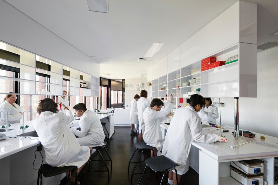
▼ 实验室环境,lab in the building
总的来说,评委们认为这个项目就是为了鼓励使用颜色来创造更加动态和具有交互感的建筑环境。 Overall, the judges agreed that this project exemplified the Award’s aim to champion designs using colour to create a more dynamic and communicative built environment. ▼ 夜间效果,night's view
|